
Ilze
Berenfelde
3-step case study
Design system
Creating a reusable component library to unify the portal’s look, improve accessibility, and speed up future updates.

Role
UX/UI designer
Deliverables
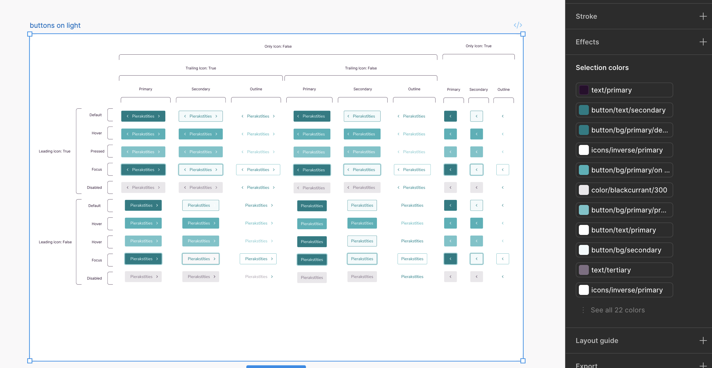
Reusable components, variants and variables in Figma
Compliance with WCAG 2.2 standards
01
Context
So we had a new redesign project and no shared foundations to build on. Every screen was designed from scratch. We needed a system that would save time now and guide all future updates.
This project became the starting point for a unified design system that connects design and development, ensures accessibility, and provides a single source.
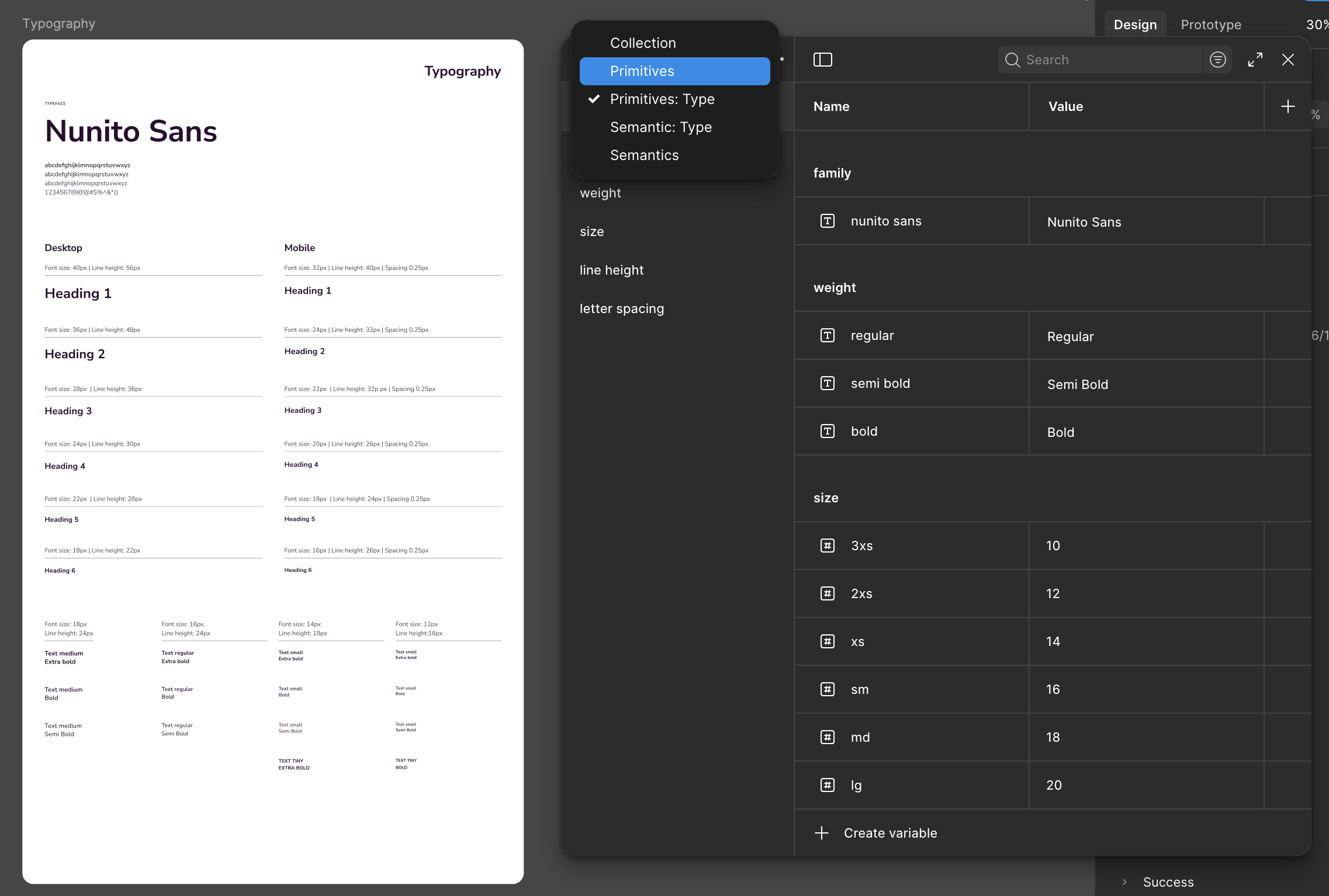
All starts with text...
02
Challenge
→ No design system means inconsistent UI across services.
→ Developers rebuilt the same components repeatedly.
→Future updates could be slow and lead to errors.
03
Approach
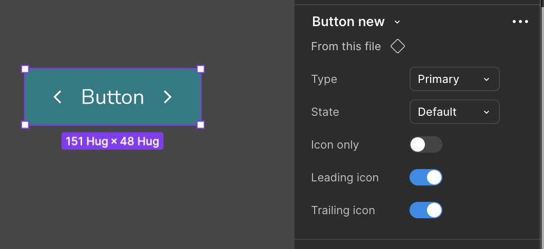
We started with an audit. Next, we defined the foundations – color tokens, typography, grid, and spacing, to set a shared visual language. We then built reusable components, such as buttons, inputs, dropdowns, and modals. Accessibility was embedded from the start, ensuring WCAG 2.2 compliance through proper contrast and focus management.
Outcome
The new design system has become a foundation for future projects – reducing design duplication, improving collaboration between designers and developers, and ensuring every update follows the same high accessibility and usability standards.
This was one piece of a larger project, where the design system served as a foundation for future iterations.
People.
Purpose.
Clarity.
Let’s work together
I’m currently open to new opportunities
© Ilze Berenfelde, working from Riga
Ilze
Berenfelde
3-step case study
Design system
Creating a reusable component library to unify the portal’s look, improve accessibility, and speed up future updates.
Role
UX/UI designer
Deliverables
Reusable components, variants and variables in Figma
Compliance with WCAG 2.2 standards
01
Context
So we had a new redesign project and no shared foundations to build on. Every screen was designed from scratch. We needed a system that would save time now and guide all future updates.
This project became the starting point for a unified design system that connects design and development, ensures accessibility, and provides a single source.
All starts with text...
02
Challenge
→ No design system means inconsistent UI across services.
→ Developers rebuilt the same components repeatedly.
→Future updates could be slow and lead to errors.
03
Approach
We started with an audit. Next, we defined the foundations – color tokens, typography, grid, and spacing, to set a shared visual language. We then built reusable components, such as buttons, inputs, dropdowns, and modals. Accessibility was embedded from the start, ensuring WCAG 2.2 compliance through proper contrast and focus management.
Outcome
The new design system has become a foundation for future projects – reducing design duplication, improving collaboration between designers and developers, and ensuring every update follows the same high accessibility and usability standards.
This was one piece of a larger project, where the design system served as a foundation for future iterations.
People.
Purpose.
Clarity.
Let’s work together
I’m currently open to new opportunities
© Ilze Berenfelde, working from Riga