
Ilze
Berenfelde
3-step case study
Self-service portal
To reduce the pressure on the support team and give users more control over their savings, we set out to build a digital solution that would make pensions understandable and manageable without help.
Please note! The following content is based on a conceptual version. Due to NDA restrictions, I’m unable to show the actual results.

Role
UX/UI designer
Deliverables
Research
Brainstorming workshop
Competitive analysis
New platform UI based on existing design system
01
Context

Many people don’t fully understand how pensions work - their knowledge level varies a lot. That’s why this portal wasn’t designed only for managing savings but also as a place to learn, where users can find clear, reliable information about pensions.
During research, we discovered that pensions are often confusing for people in the Baltics. Some even believed that pension pillars work like “levels in a game” – you start in the first, move to the next, and finally reach the third. These insights guided us to design a portal that feels both educational and easy to navigate.
02
Process
While the Latvian team already had a clear vision of what the portal should include, the Lithuanian team still had many open questions about how to structure and deliver it.
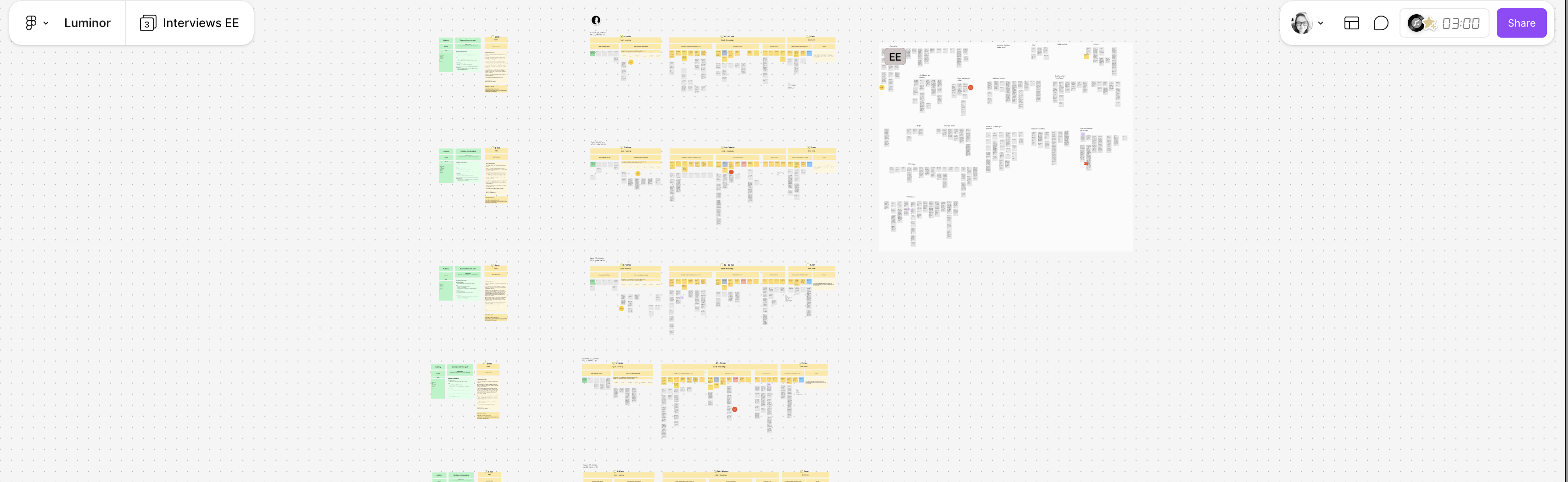
To align expectations and define what needed to be built, I facilitated a short brainstorming workshop. Using screenshots of the Latvian version as a base, we mapped missing information, identified functional gaps, and outlined what should be included in the Lithuanian self-service portal.
03
From Research to Design
Educational resources
After aligning on the required content and functionality, I created the UI for the new self-service portal. The design was based on the existing design system to ensure consistency with other bank products.
The UI screens also served as an interactive prototype, which helped the team validate user flows, review copy, and test the overall experience before development.
My role
My role was to transform research findings and workshop outcomes into a clear, intuitive interface. Even without showing the prototype, this case study reflects how I work end-to-end: from understanding the problem, mapping needs, facilitating collaboration, and designing a usable solution.
This case study represents just one part of the broader work we delivered in collaboration with the bank, including other initiatives such as user journey mapping, persona creation, and preparing mobile app prototypes and test scenarios for user testing.
People.
Purpose.
Clarity.
Let’s work together
I’m currently open to new opportunities
© Ilze Berenfelde, working from Riga
Ilze
Berenfelde
3-step case study
Self-service portal
To reduce the pressure on the support team and give users more control over their savings, we set out to build a digital solution that would make pensions understandable and manageable without help.
Please note! The following content is based on a conceptual version. Due to NDA restrictions, I’m unable to show the actual results.
Role
UX/UI designer
Deliverables
Research
Brainstorming workshop
Competitive analysis
New platform UI based on existing design system
01
Context
Many people don’t fully understand how pensions work - their knowledge level varies a lot. That’s why this portal wasn’t designed only for managing savings but also as a place to learn, where users can find clear, reliable information about pensions.
During research, we discovered that pensions are often confusing for people in the Baltics. Some even believed that pension pillars work like “levels in a game” – you start in the first, move to the next, and finally reach the third. These insights guided us to design a portal that feels both educational and easy to navigate.
02
Process
While the Latvian team already had a clear vision of what the portal should include, the Lithuanian team still had many open questions about how to structure and deliver it.
To align expectations and define what needed to be built, I facilitated a short brainstorming workshop. Using screenshots of the Latvian version as a base, we mapped missing information, identified functional gaps, and outlined what should be included in the Lithuanian self-service portal.
03
From Research to Design
Educational resources
After aligning on the required content and functionality, I created the UI for the new self-service portal. The design was based on the existing design system to ensure consistency with other bank products.
The UI screens also served as an interactive prototype, which helped the team validate user flows, review copy, and test the overall experience before development.
My role
My role was to transform research findings and workshop outcomes into a clear, intuitive interface. Even without showing the prototype, this case study reflects how I work end-to-end: from understanding the problem, mapping needs, facilitating collaboration, and designing a usable solution.
This case study represents just one part of the broader work we delivered in collaboration with the bank, including other initiatives such as user journey mapping, persona creation, and preparing mobile app prototypes and test scenarios for user testing.
People.
Purpose.
Clarity.
Let’s work together
I’m currently open to new opportunities
© Ilze Berenfelde, working from Riga